
Primer Rebrand
Redesigning Google Primer to align with the Google Brand.

The Project
When the Google Primer App was integrated into the Grow with Google ecosystem, it stood out. The illustration style was different and non-inclusive, the colour palette wasn’t on brand, Google Sans the proprietary font was nowhere to be seen, and the logo – well, it didn’t look like it could sit alongside the over 700 other product logos within Google. In Primer’s beta years, the brief was for it to not look like a Google product. But the app evolved into something bigger, and Google wanted to make it official.
The Problem
Google Primer became an official Google Product, being absorbed into the behemoth philanthropic education wing of Google that is Grow with Google, but it didn’t look like a Google Product.
Marketing the product was tough because there was a very obvious cut-paper aesthetic that was completely breaking Google’s visual/illustration guidelines. The UI design was also outdated and didn’t follow Google Material Standards. So not only was the brand refreshed, the UI of the product was completely overhauled as well. Yes, all at the same time over 1.5 years.
The Analysis
Every single piece of Primer’s Brand needed to be touched. The list was long:
Color Palette
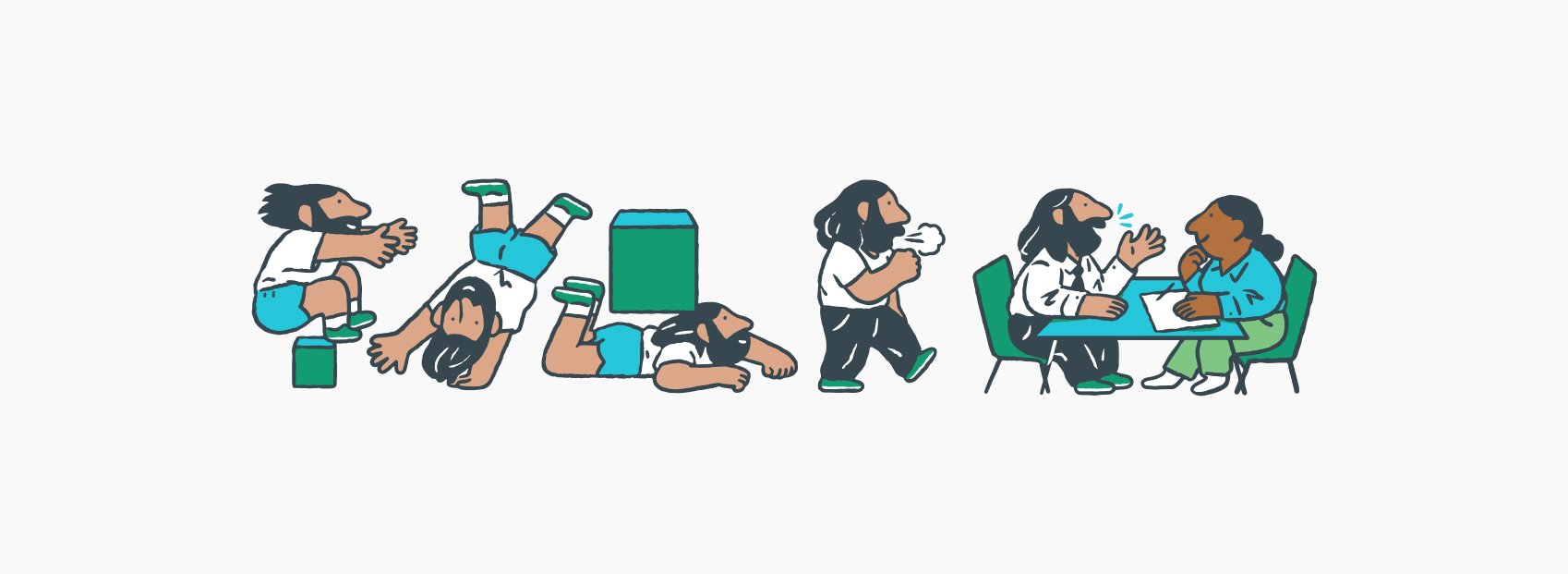
Illustrations
Typography
Product UI
Store Screens
Marketing Collateral (website, emails, social posts, one pagers)
Logo (I pushed for this to be on it’s separate track – I tasked our Senior Designer to explore/concepts/final design) while I focussed on the UI and branding.
My Role
Facilitating every moving component between Design/Dev/Leads, contributing to timeline expectations alongside our project manager, on the tools ensuring Google brand guidelines were adhered to whilst allowing Primer’s personality to shine through – that was everyday. On the design side more specifically, my main contribution:
Design Lead
UI Design
UX Design
Presentation Design
Primary presenter to Leads/Stakeholders
Keep our happy users, happy
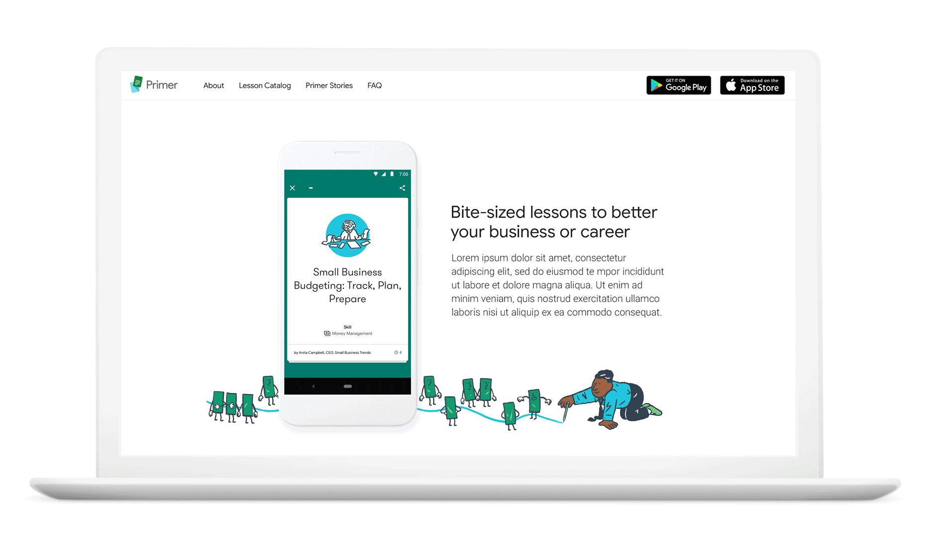
How do we refresh Primer’s brand without completely losing Primer’s identity? Primer was known for being light-hearted with heavier topics, short and fast when you’re on the go, and full of fun, witty illustrations that helped engage our users, and let’s be honest Google’s look is clean and beautiful, but a little clinical. We needed to ensure Primer’s light-hearted personality still shone through whilst adhering to Google’s Brand Standards. Also, we had to keep in mind, that our users loved us.
30+ million downloads over its 8 years (2015 - 2023)
3 million global monthly active users
One of Google’s highest ratings in store
(Appstore 4.9 / Playstore 4.6)
International reach with support for
13 languages
Google Primer, rebranded


Design system

Store screens
I pitched reducing this number from 8 to 6, because the first three are the most important, and there was an opportunity to streamline our messaging. Also, we were creating the store screen images ourselves – 1 set for Playstore, and 3 sets for Appstore. Start to do the math: One language, fine. But 13 languages you don’t speak? Epic!

Who doesn’t love a before and after?

Dream-team deets are as follows:
Alex Miller, Lee Felarca, Jeff Cranford, Natacha Fernandez, Justin Cegnar, Kayla Wellbery, Gwendal Le Bec, Carol Teixeira